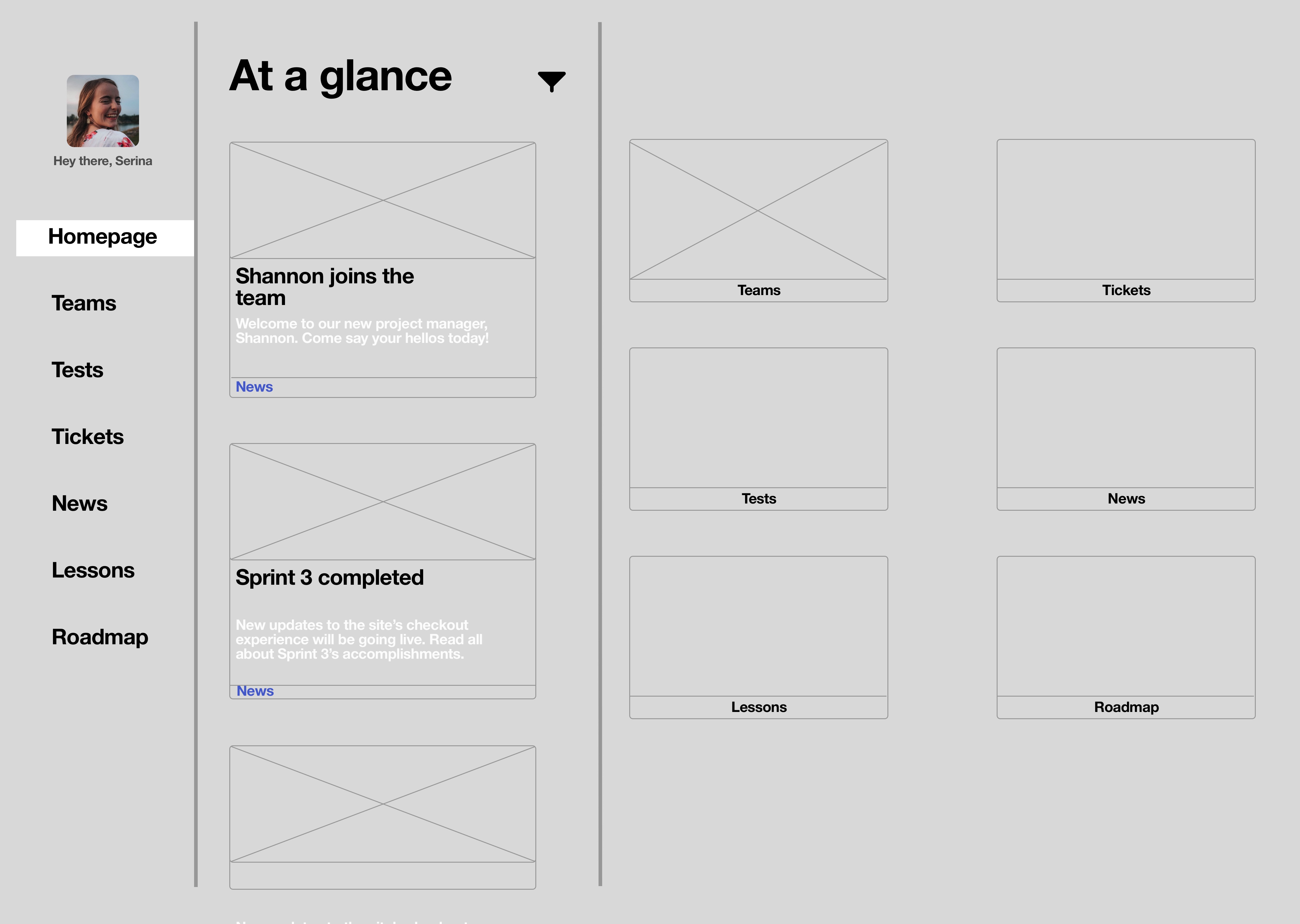
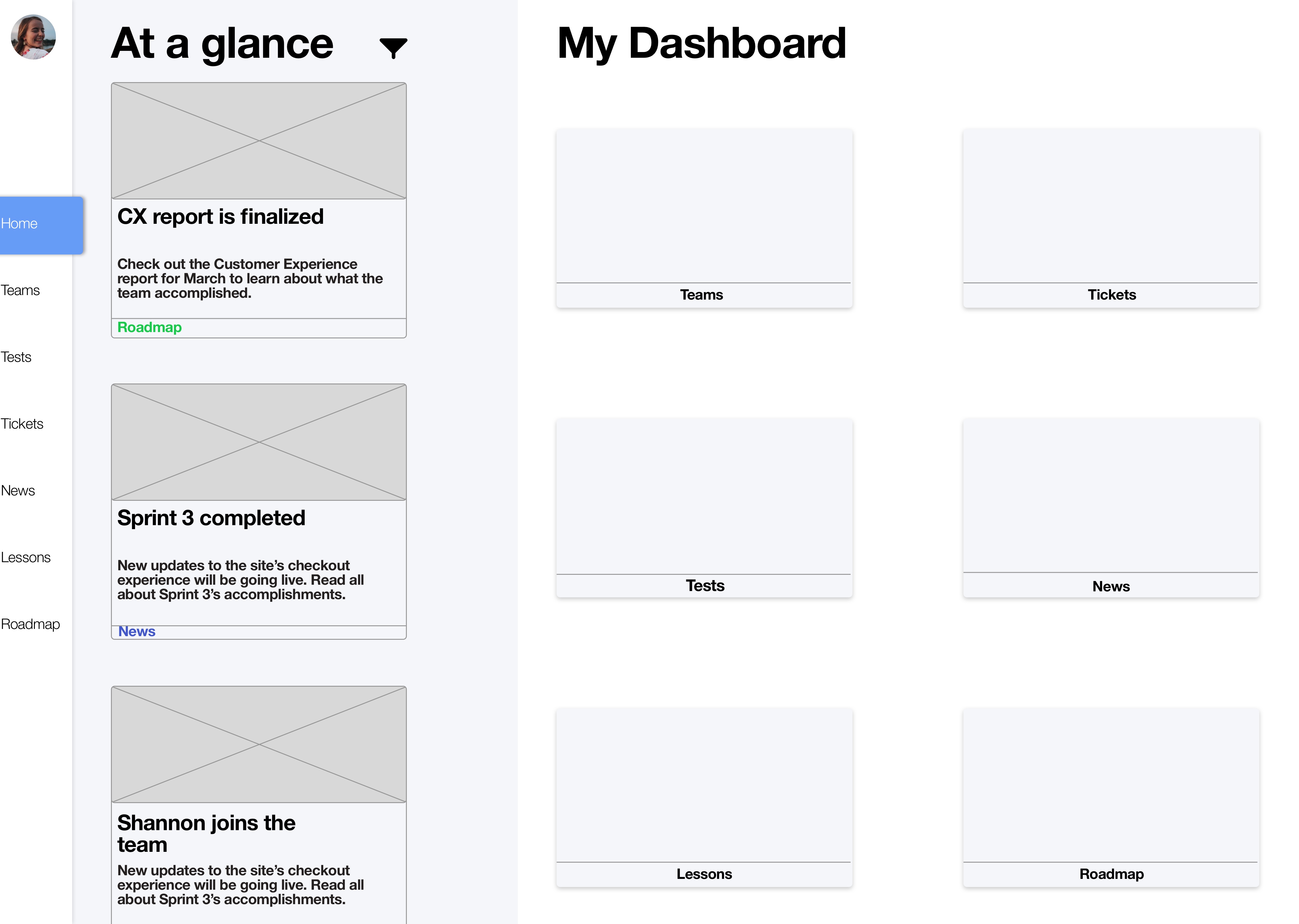
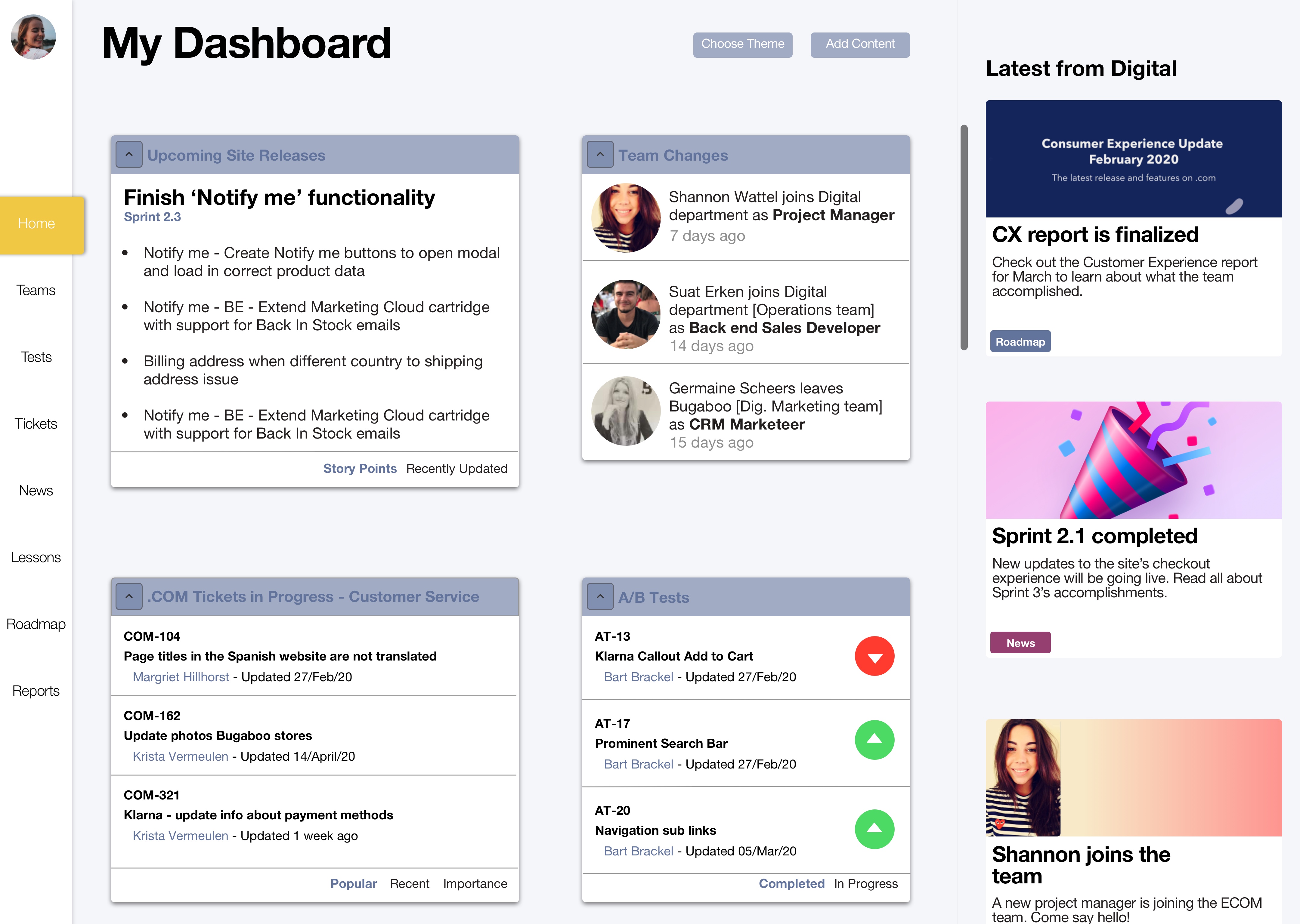
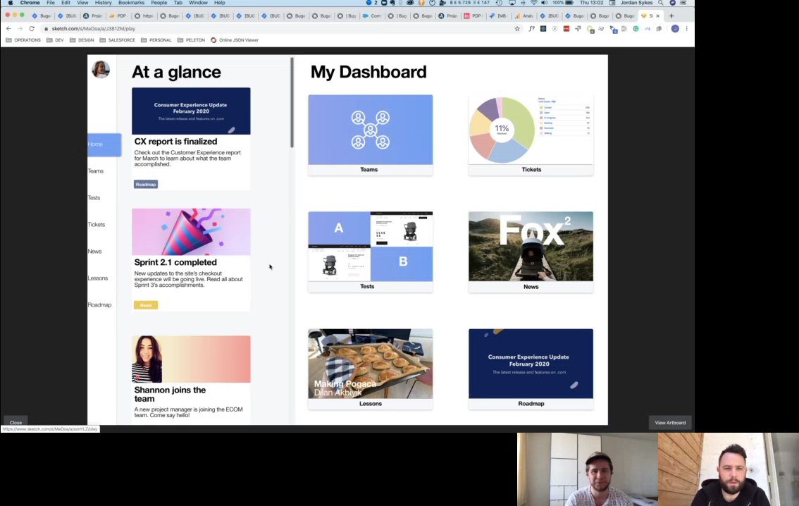
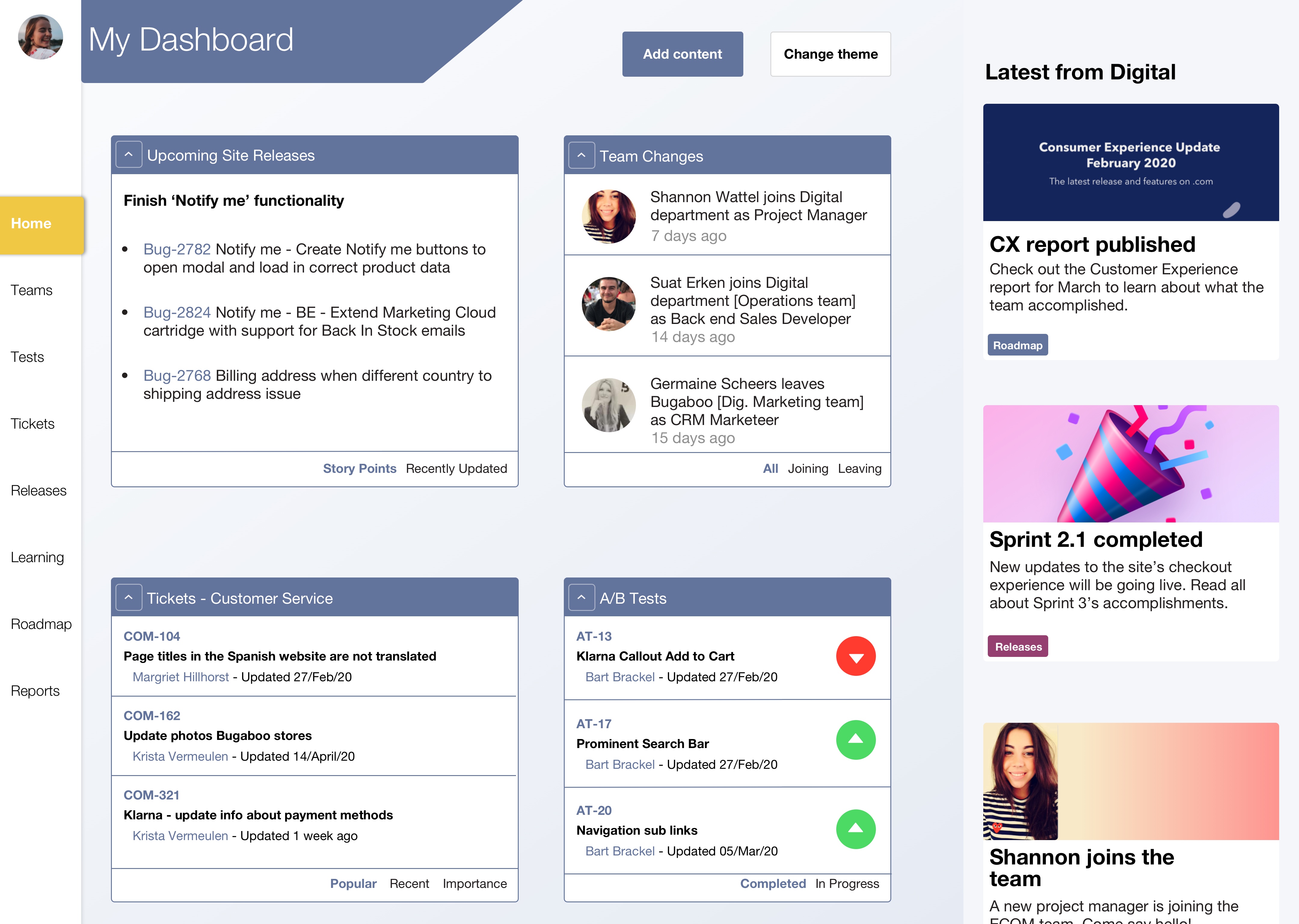
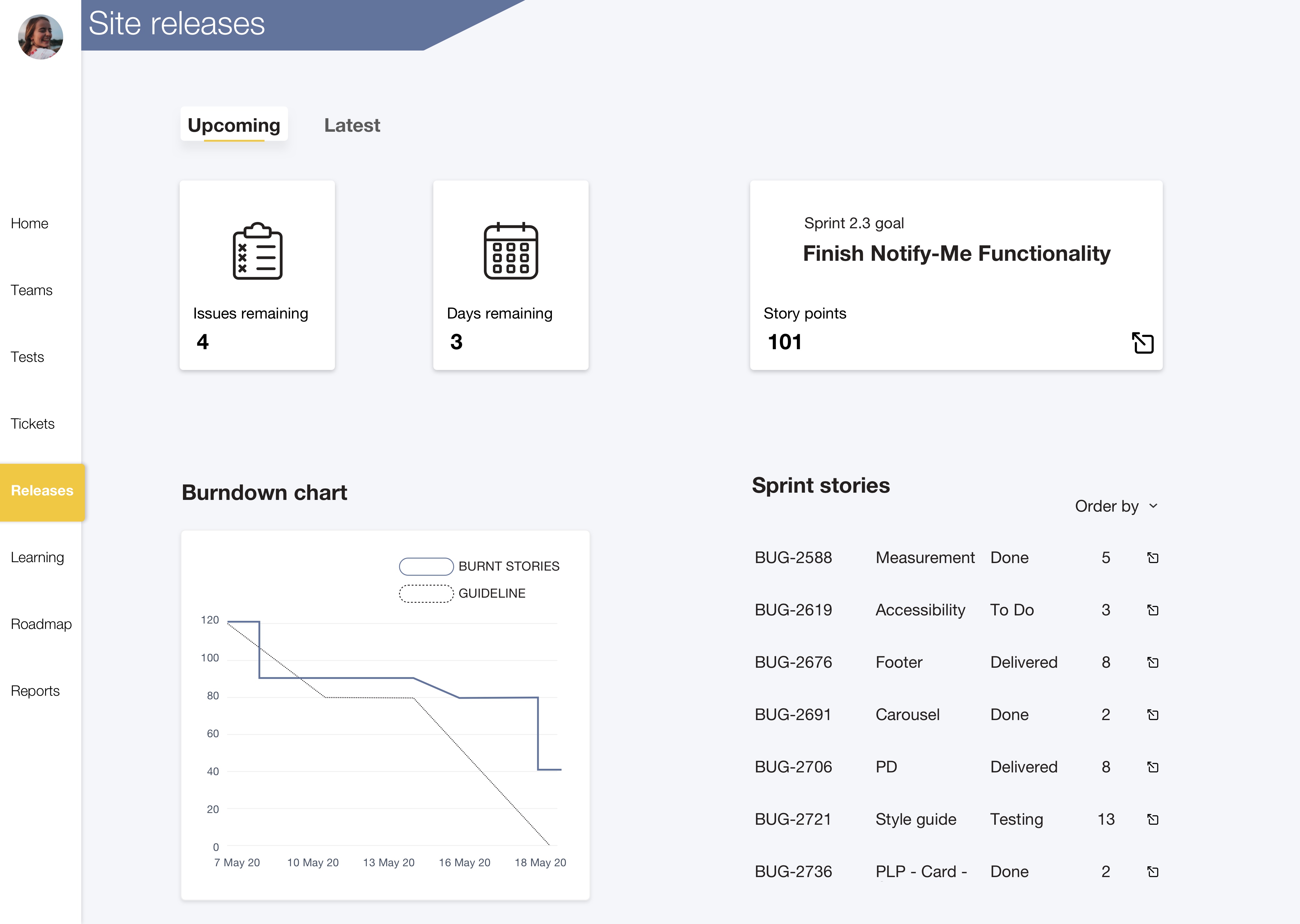
Digital Dashboard, Bugaboo

LEAD DESIGNER / UX & UI / Feb 2020 - June 2020

Overview

I conducted my graduation project at Bugaboo. Bugaboo is a large corporation with many different departments all separated onto different floors. Since the organization is so large, different departments don’t know what one another are doing, creating a siloed organization. The Digital department of Bugaboo wished to be the catalyst of change for this dilemma, leading by example by increasing their transparency and information flow to other departments by creating a dashboard.

ROLE
UX Designer

METHODS
Paper prototyping, Co-creation, User testing, Design Thinking

TOOLS
Sketch, Illustrator, Typeform, Excel, Hotjar

TIMELINE
February 2020 - May 2020

Key Features

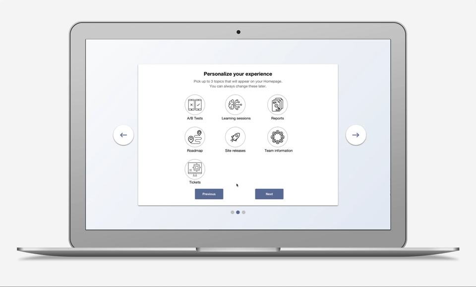
Personalized content

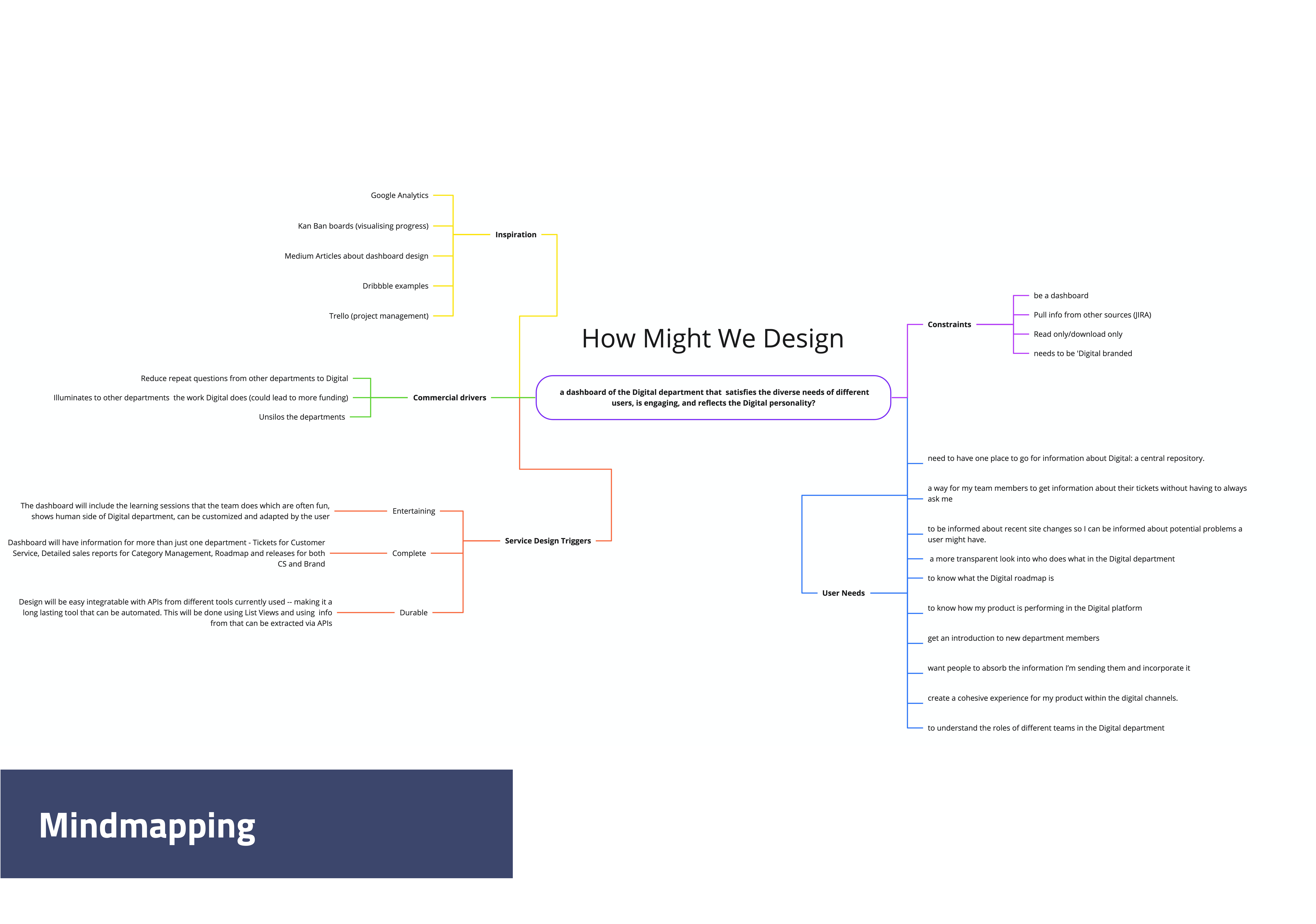
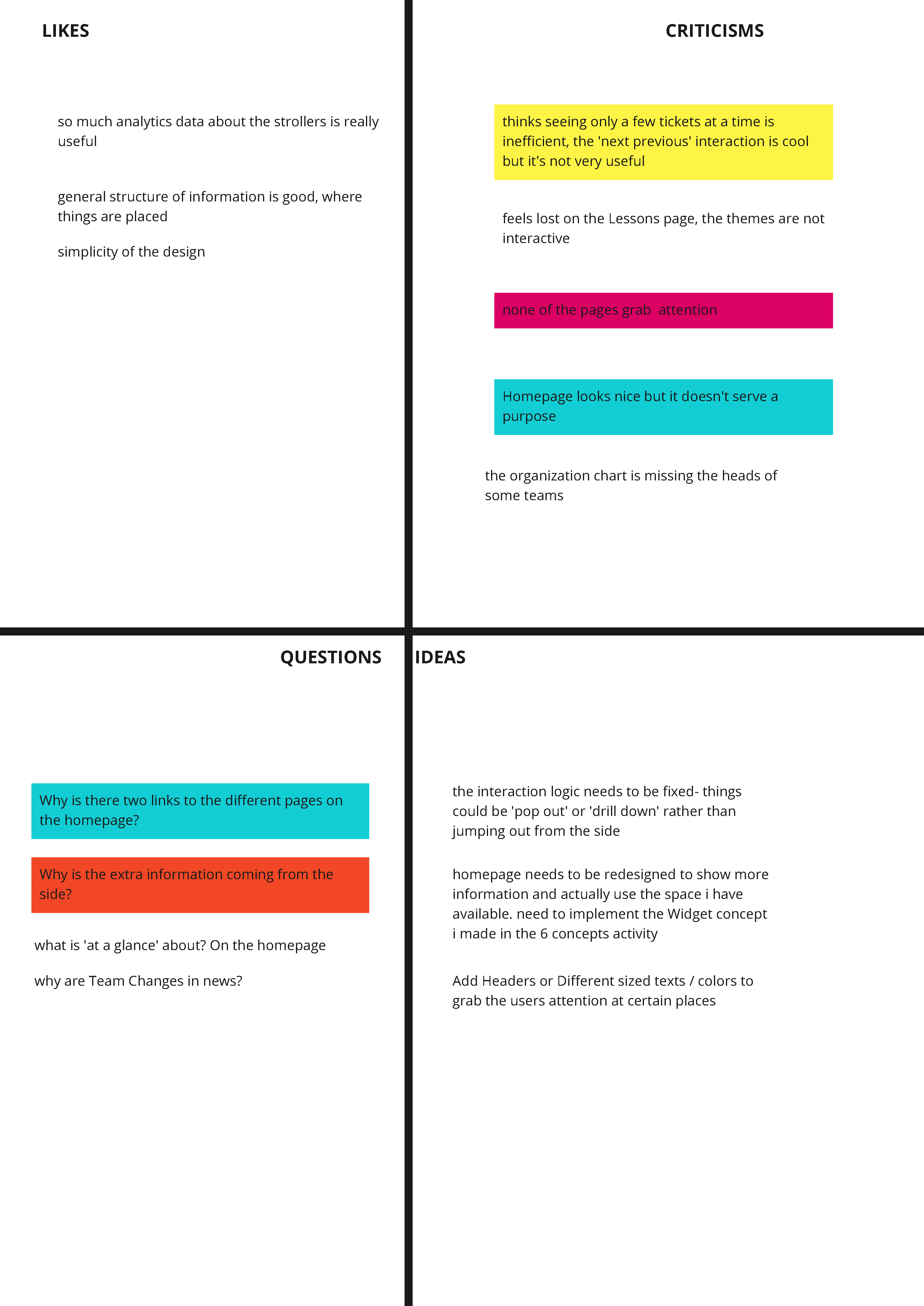
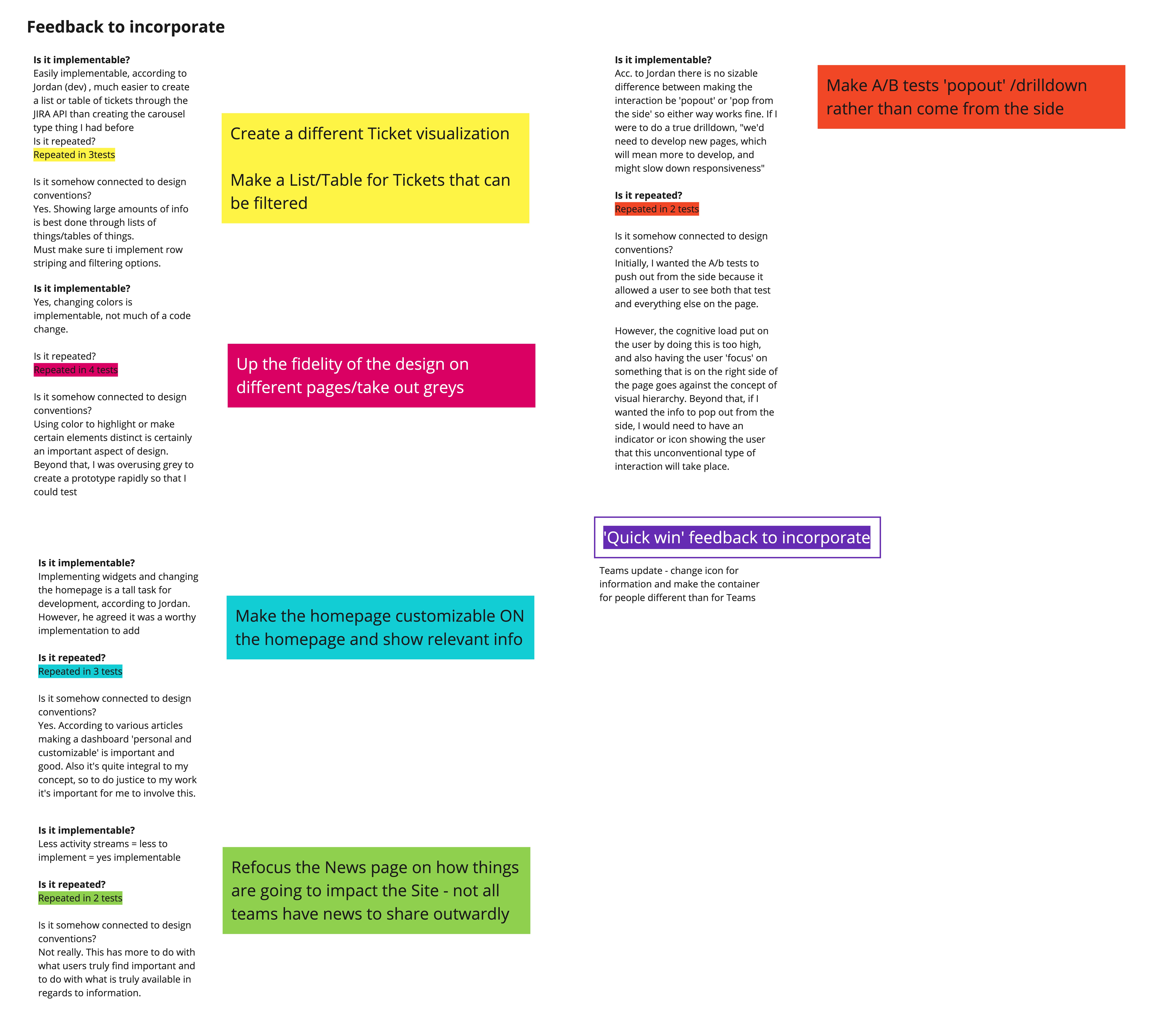
Issue: User needs are diverse, different departments need to see different things.
Including an onboarding process where users choose what type of content they want on their homepage allows the diverse needs of the different user groups to be met and takes the onus off of users to retroactively change the displayed content.

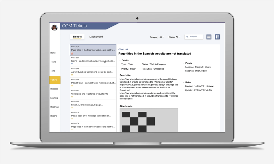
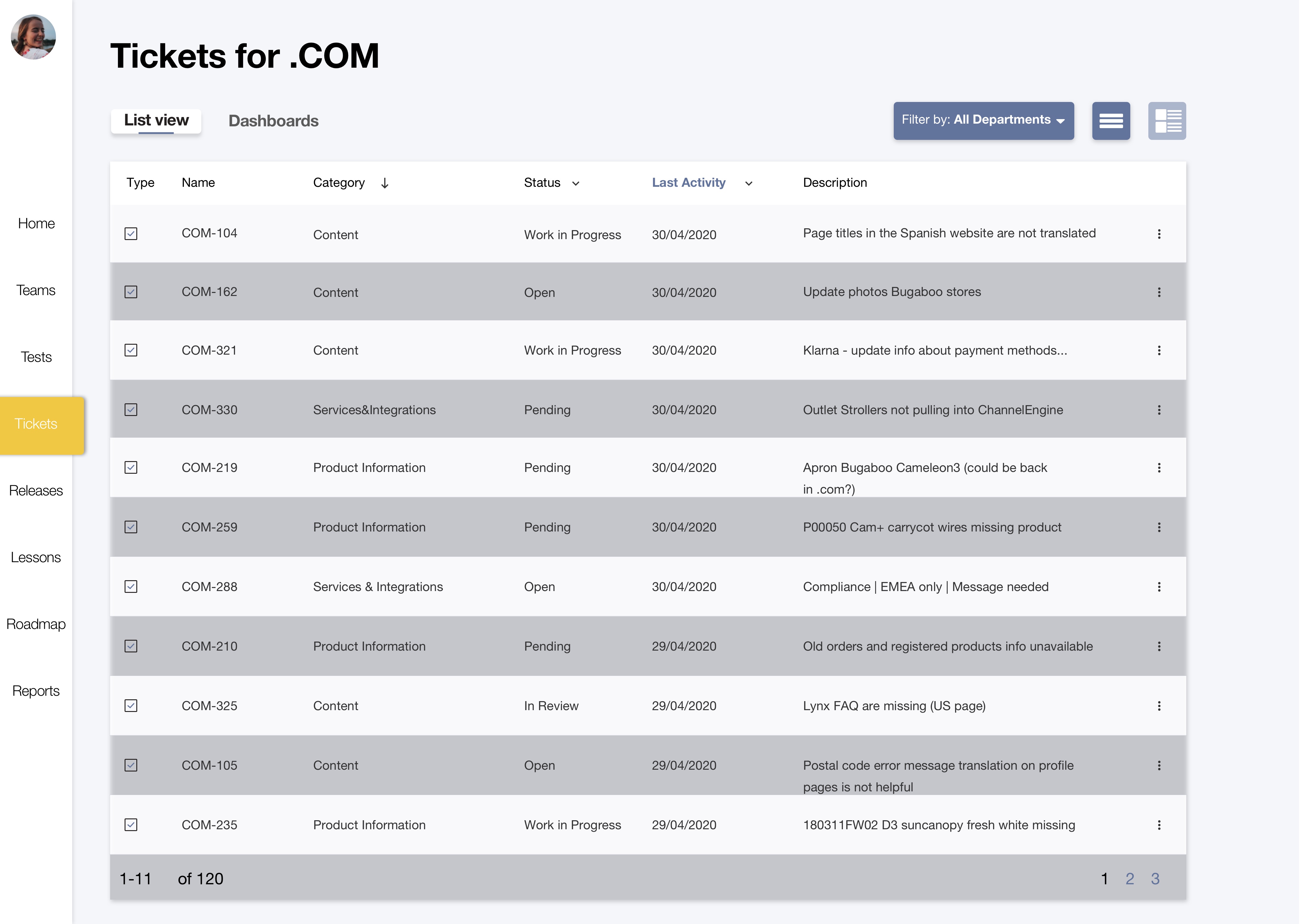
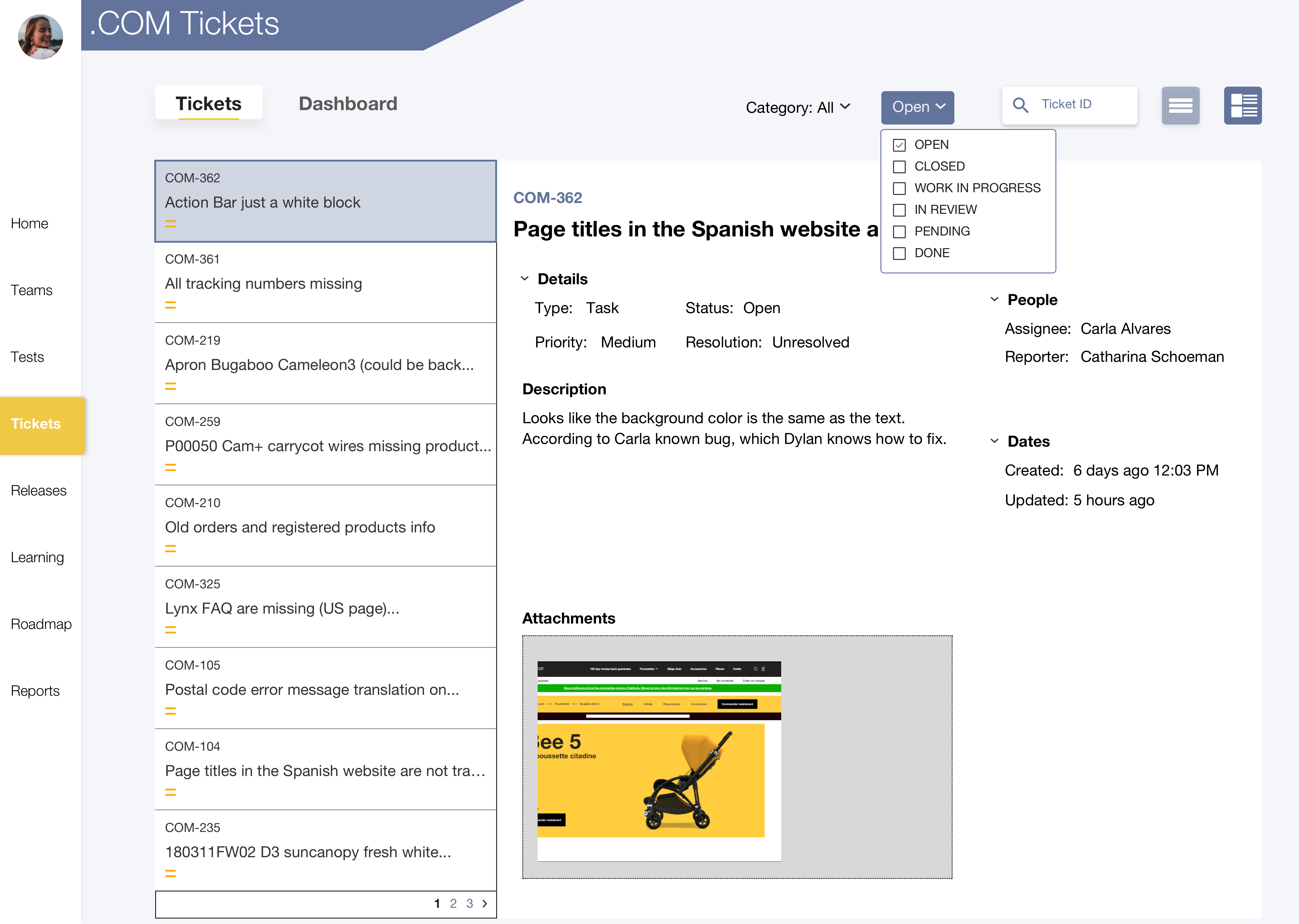
Site issue information

Issue: Only some people have access to JIRA despite many people benefitting from potential access.
Inclusion of these tickets in the dashboard allows for more stakeholders to get the information that they need regarding site issues. Especially pertinent for Customer Service workers who do not have access to the .COM board and therefore have no idea about whether issues customers complain about are being worked on or not, forcing them to ask the singular point of contact in their department about these issues.

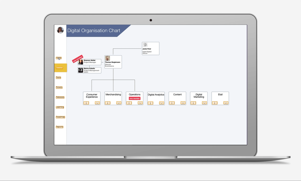
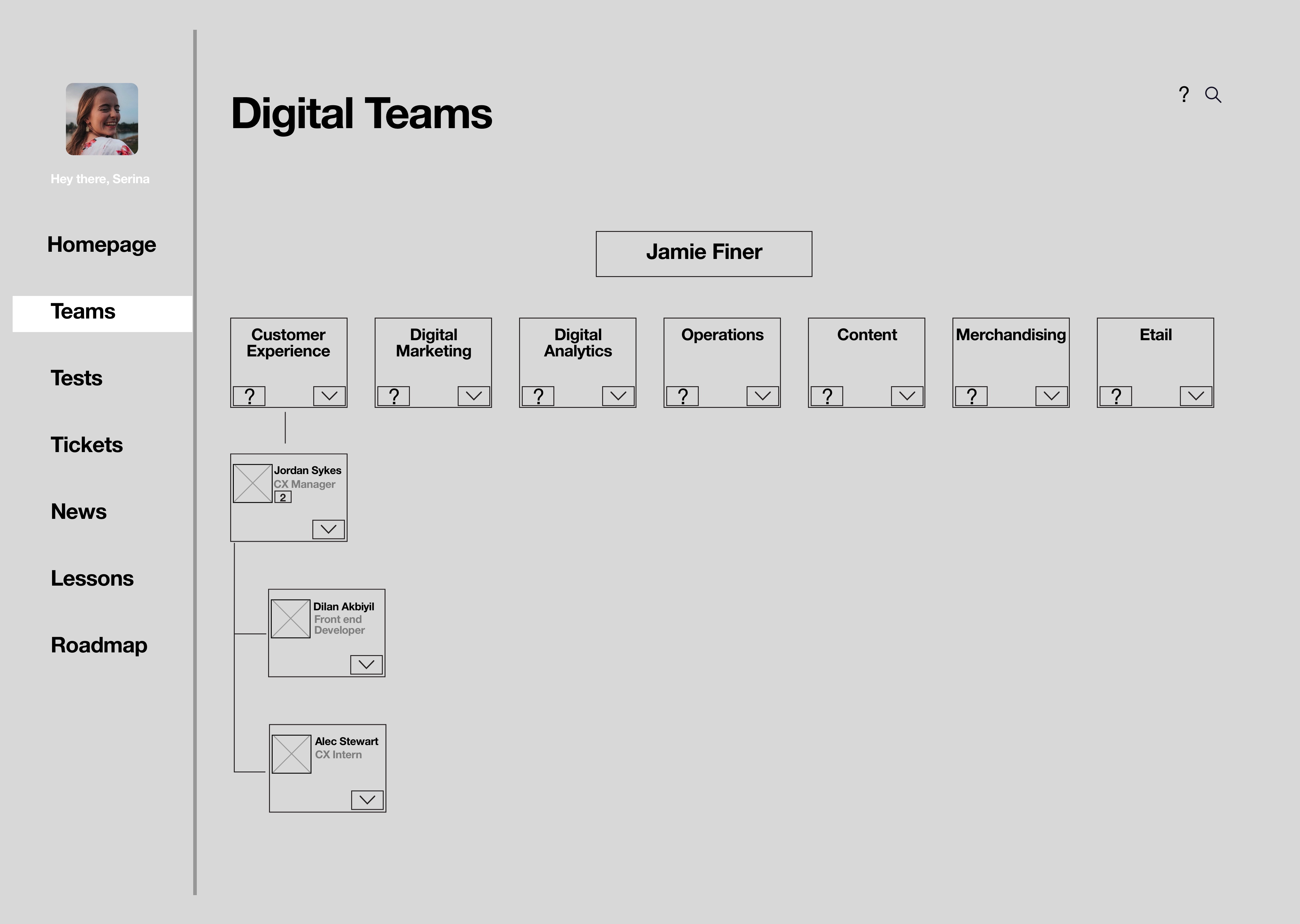
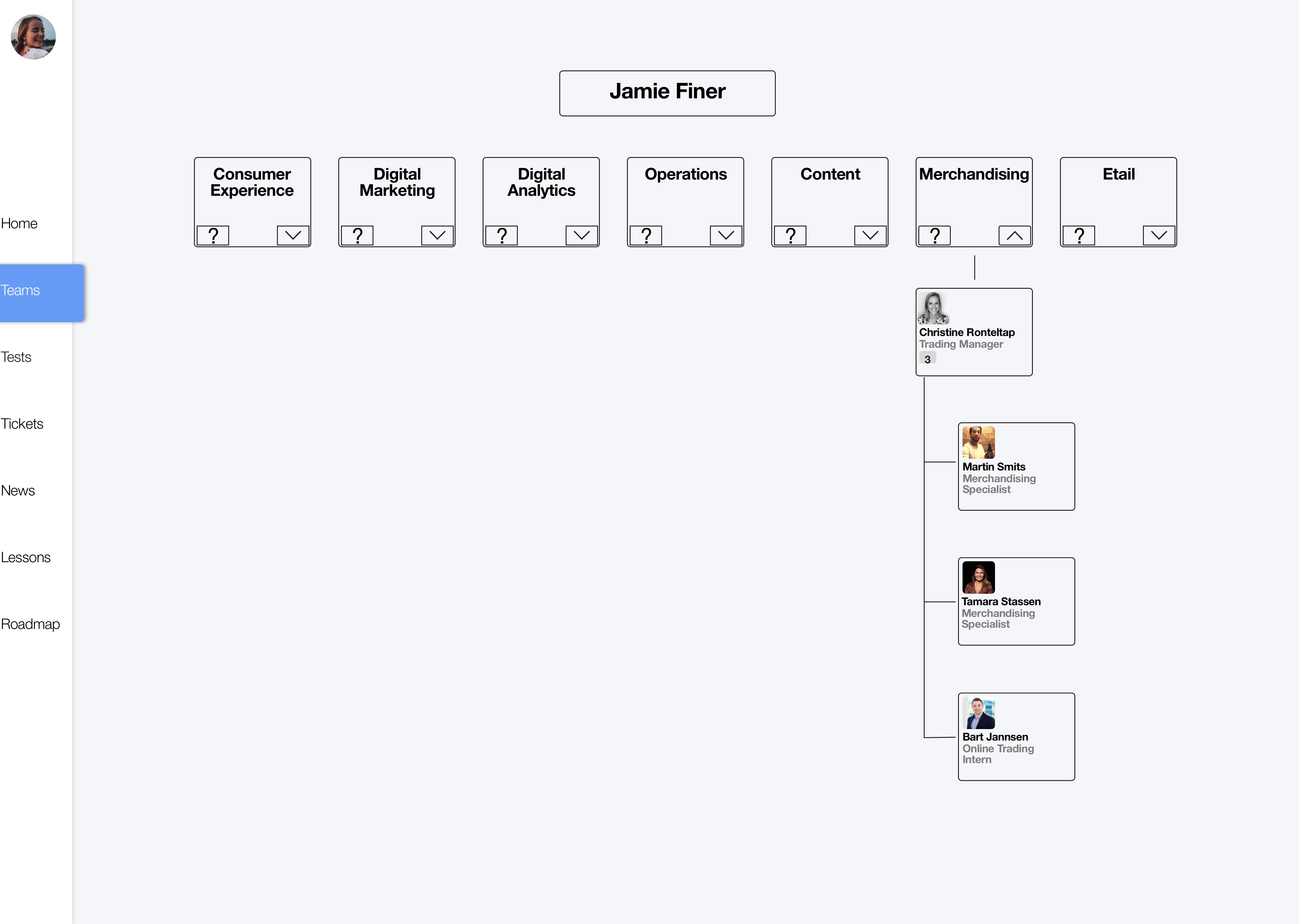
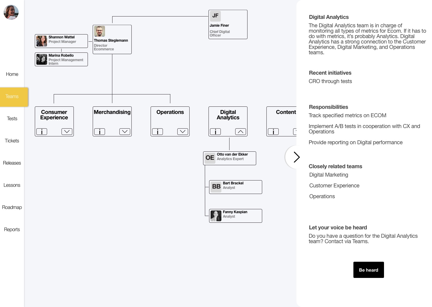
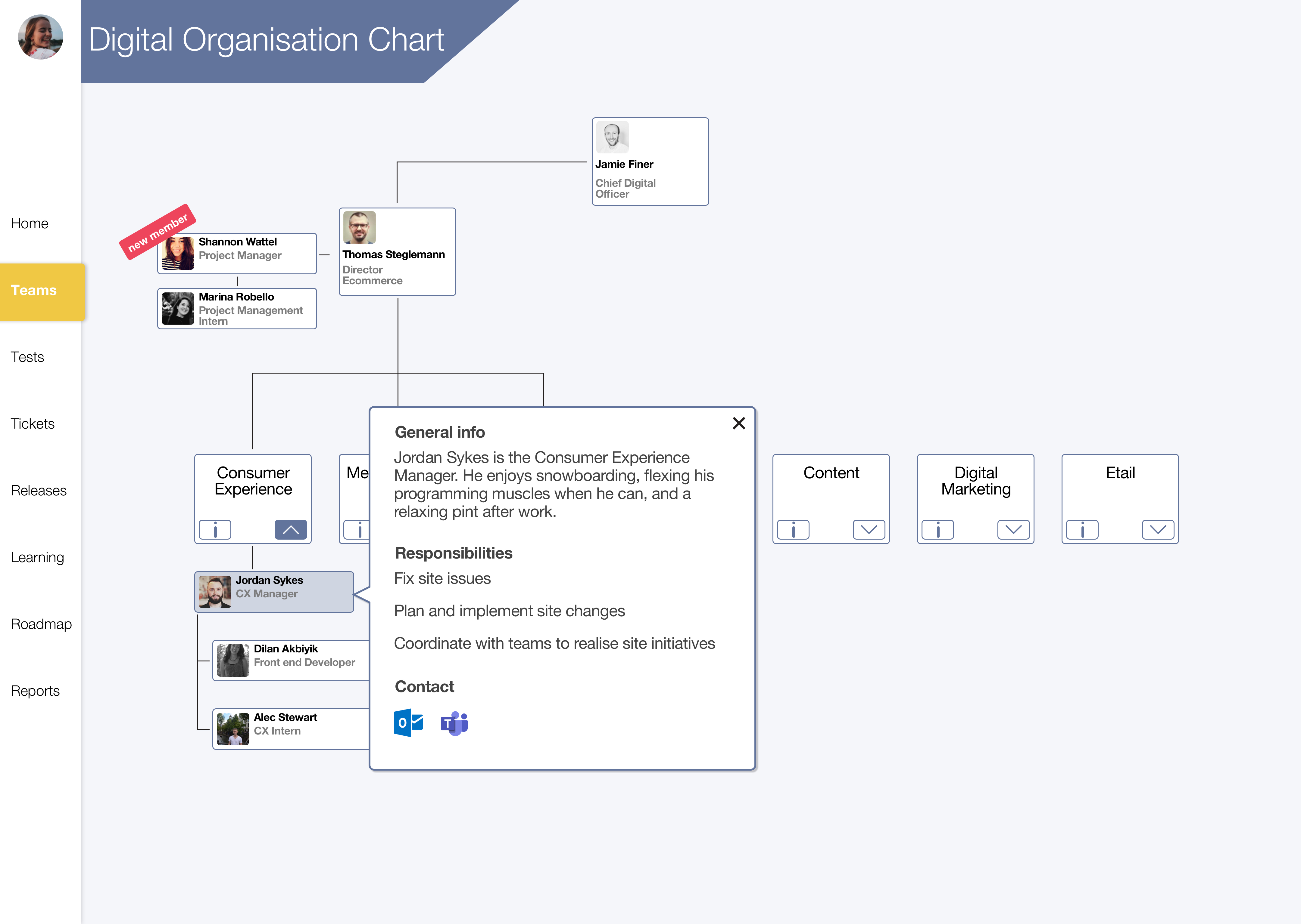
Detailed team information

Issue: Users don't know who does what in the Digital department.
Providing information on what different Teams do within the Digital department allows users to know who does what within the Digital department, and helps interdepartmental transparency. This also fulfills a business need as there is no current organization chart.

Project Framework

I followed the Design Thinking method throughout this project. Letting user research be my guide, I brainstormed and designed multiple solutions. I then tested these ideas via usability tests and developed a high-fidelity interactive prototype based on the findings of user testing. Using the Design Thinking Method really helped me to plan my process with different techniques and activities for each defined portion of the method.

Research aim & methods

The aim of this research is to determine whether there is a problem with information flow between departments and how that problem impacts the organization, to determine what kind of information would be useful to users by empathizing and researching them, and also to determine how best to display this information within a dashboard.

Literature Review
User interviews
Questionnaire
Personas
Research Results

The results of my research culminated into 5 main insights corroborated by multiple research methods, and personas created for each department within Bugaboo. The distinction between each department was made because the needs of each department is so diverse and must be addressed separately. These research outcomes helped me to develop a design challenge for myself and also helped guide my ideation and design phases of my process.

1 Lacking transparent roles

People don't know the different teams of Digital and the roles of these teams which makes it hard to interact and entrenches siloing.

2 Site changes are not explained

The Digital department makes regular changes to the Bugaboo website. This has significant impacts on other departments like Customer Service. Despite this, Customer Service learns about site changes retroactively from customers.

3 Intercultural disconnection

Cultural fragmentation exists within Bugaboo fostered by a variety of factors including competition for stock between Digital and retail departments, a general lack of interaction between departments, and limited transparency.

4 Lack of collaboration in high level planning

There is a lack of knowledge regarding Digital’s plans for the future, this limits possibility to collaborate between departments, and also hinders overall transparency leading to a less efficient organization.

5 Reliance on single points of contact

Interdepartmental interaction most often flows through one person, the dissemination of this information is subpar.

How might Bugaboo's Digital department increase interdepartmental transparency and account for the diverse needs of different departments?

Ideating concepts

In order to answer this question that I had posed to myself, I had to ideate on possible solution avenues. To facilitate this ideation process, I conducted 3 different ideation techniques and landed on one final concept.

Solution

A customizable dashboard, customizability is based on the trigger of having such a variety of user needs, for it to have information outside of just data (like weekly learning sessions) based on the service design trigger of ‘Entertaining’, and that I wanted the dashboard to provide an opportunity for learning to the user. This concept combined with the user need/content match activity created a good framework from which I could start wireframing a dashboard.

Wireframes

When I worked on the wireframes, I decided to go with a sidebar navigation in order to preserve an even hierarchy between the different sections of the dashboard since my research showed me that different sections are more or less important to a user depending on that user's department.

Wireframes V1 - Homepage
Wireframe V1 - Teams page
Wireframes V2 - Homepage
Wireframe V2 - Teams page
Hi-Fi Design and Prototype

Moving from the wireframes I had created, I incorporated the feedback from my boss and colleagues to improve upon the skeleton I had created through the wireframe process. One integral piece of feedback I received was to validate the Information Architecture that I had created for the dashboard, I did so by doing a Card Sorting activity with end users and analyzing the results of this activity to create a new IA for the prototype. Some other notable changes include increased whitespace across the design as many pages were too crowded and the implementation of customizable widgets on the homepage.

Prototype V1 - Homepage
Prototype V1 - Teams page (more information selected)
Prototype V1 - Tickets page
Prototype V1 - Releases page
Usability testing and final design

Because of COVID-19, I had to get a bit creative with my usability testing. To conduct the tests remotely, I uploaded my prototype to Sketch Cloud and asked my users to interact with the prototype through the functionality of Sketch Cloud.

I recruited 5 Bugaboo employees for each round of user testing. I made sure to include Bugaboo members from every department that interacts with the Digital department.
My goals for the testing were:

1. Test discoverability of different components within the dashboard
2. Understand how users feel about this dashboard
3. Learn more about what users might want to include in the dashboard

Final Design

My final design encompassed opportunities to address the user needs that I defined utilizing the insights I discovered in research. Through my user testing sessions, I was able to refine many different pages of my dashboard and even added new content, like the average time to resolution for issues. Although developing this dashboard was outside the scope of my project, I ensured that every piece of content within the dashboard was based on real and tangible information that could easily be developed when the time came to move from design to working dashboard.

Final prototype - Homepage
Final prototype - Team page
Final prototype - Tickets page
Final prototype - Upcoming releases page
Reflection

Improving my process. The Card Sorting activity is something I would have liked to do differently in my process by incorporating the activity earlier on in my process. I did it after the first iteration of my prototyping, and it would have certainly been better to do it prior to this phase since there was no basis for the Information Architecture initially, other than my intuition. However, I was able to make the best of it, and was still able to implement the outcomes of the card sorting method to modify my Information Architecture to more closely align with my user’s mental models. Another issue I ran into with card sorting was not thinking far enough ahead. I initially did the card sort through Miro, but realized I had no way to analyze these results in an effective manner. This forced me to manually copy the results from Miro into a different card sorting tool that actually allows for quick categorization and analysis.Beyond that, it would have made more sense to do a Closed Cart Sort because I had already defined specific categories within my dashboard. However, if I had indeed done that, I wouldn’t have found the need for a new category that consists of different reports and updates from various departments because users would just use my predefined categories.

Culture shifts. The user testing and iterative phases of my design process could have the potential to change some aspects of the working culture within the Digital Peleton team (Consumer Experience, Operations, Merchandising). During the feedback portion of my final presentation, my boss’s boss, Thomas, remarked,

What I find most interesting is your methodology that you’ve applied. Instead of just doing something, you’re iterating, testing different things. I think this is, for all of us, a great example on how we should be designing the Product Detail page, or how do we design a landing page. Actually getting out there and getting feedback, that is for me the interesting thing that I think we need to do more of.

While this potential change will not be spurred on by the products I created specifically, the process that I followed and explained does have the potential to make an impact on how the Digital Peleton works. Hopefully, leading to a more UX Mature organization in which more user testing, and user centered methods are employed when working towards the creation of products and content.

Other projects

UX / RESEARCH / DASHBOARD DESIGN

Tool to Help Ex Offenders Reintegrate

A 3 part tool including a wearable, mobile app, and ambient visualization that tracks and monitors
stress levels made for ex-offenders.

View Case Study

UX / RESEARCH / DASHBOARD DESIGN

Interactive Table for City Planners

An interactive surface to help urban planners
come to consensus through visualized infrastructure, policy tracking, and promotion of discussion.

View Case Study